Charting Data Differently: Text-Based Visualizations in R
We all love ggplot. If you're an R enthusiast, you're probably no stranger to the magic of the ggplot2 package. It's a go-to tool for crafting beautiful, data-rich visualizations that turn raw numbers into insightful graphics. And rightfully so – ggplot2 is a fantastic resource that has revolutionized data visualization in the R ecosystem.
However, in our love affair with ggplot2, we might sometimes overlook a simpler, more straightforward approach: creating ASCII plots directly in a data.table. Yes, you read that right – good old text-based, no-frills plots that can be remarkably effective in certain situations.
In this post, we're going to take a step back from the world of intricate ggplot2 visualizations and dive into the charming simplicity of ASCII plots. Why? Because sometimes, having a plot generated directly in a data.table is the way to go: you can display it in the console, or automatically create HTML tables with plots for short reports, for example.
The plotting function
For the function that generates the ASCII plot, we'll use simple ASCII bars that range from ▁ to ▇. Unfortunately, this also means that our ASCII plot will be limited to those 7 bars with differing heights to display all of the data we want to plot. That's a limitation we have to live with - but since an table-embedded ASCII plot is best suited to plot "the trend" of the data, it's okay. For a full-fledged plot, just use ggplot2.
make_plot <- function(v) {

  sym <- c(
    "1" = "▁",
    "2" = "▂",
    "3" = "▃",
    "4" = "▄",
    "5" = "▅",
    "6" = "▆",
    "7" = "▇")

  rank <- dplyr::dense_rank(v)

  norm_factor <- max(rank) / 7
  rank <- rank / norm_factor
  rank <- ceiling(rank)

  plot <- ""
  for (i in rank) {
    plot <- paste0(plot, sym[[as.character(i)]])
  }
  return(plot)
}
The ASCII bars are put in a named vector with labels ranging from 1 to 7.
The core of the function relies on dplyr's dense_rank function. This nifty tool ranks the values in a vector according to their relative standing.
To illustrate, if you were ranking 10 random numbers between 1 and 50, they would be assigned ranks from 1 to 10 based on their respective values.
> test <- sample(1:50, 10, replace = FALSE)
> test
 [1]  5 24 49 47 33 48  4 18 19 27
> dplyr::dense_rank(test)
 [1]  2  5 10  8  7  9  1  3  4  6
Now that we've ranked our values, the next critical step is normalizing these ranks so that they all fall within our desired range of 1 to 7. As we're working with only seven ASCII bars, it's essential to ensure our data aligns with these available bar heights.
Lastly, we'll match the appropriate ASCII bar to our normalized rank vector, accomplished through a for loop towards the end of the function.
Let's see how our ASCII plot looks using a test variable.
> test
 [1]  5 24 49 47 33 48  4 18 19 27
> make_plot(test)
[1] "▂▄▇▆▅▇▁▃▃▅"
Not bad! The plot reaches its peak at the third position (with a value of 49) and hits its lowest point at the seventh position (with a value of 4).
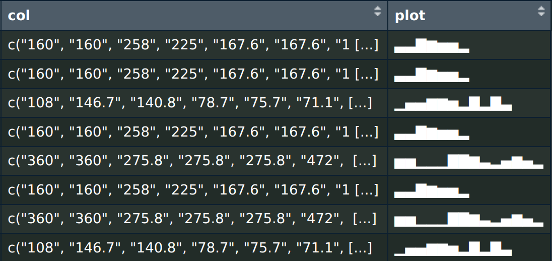
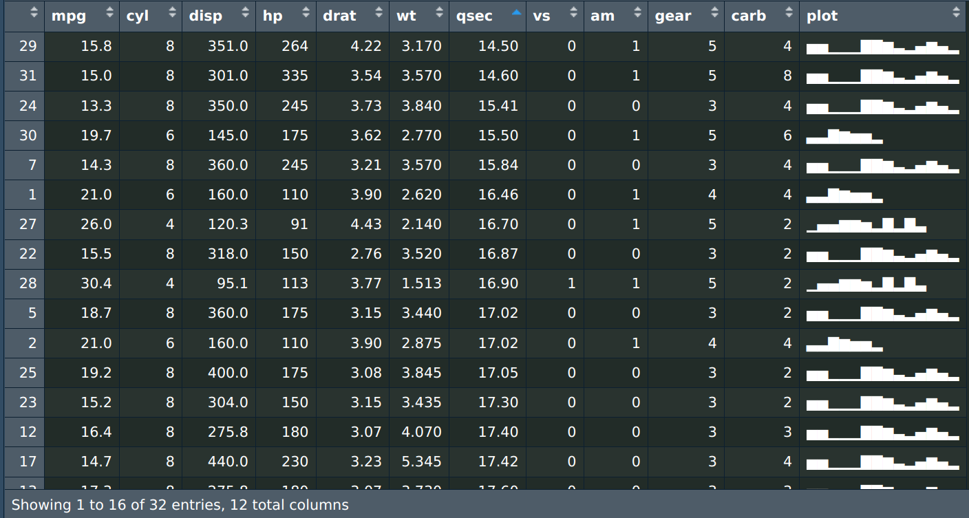
Now, it's time to apply the magic to our beloved mtcars dataset. How about plotting the displacement of cars by cylinder?
First, we have to create a new column with a vector of displ values grouped by cylinder, and then apply the make_plot function to each row of the newly-created column.
dt <- data.table::as.data.table(mtcars)
dt[, col := toString(disp), cyl]
dt[, col := strsplit(col, ", ")]
dt[, plot := lapply(col, make_plot)]
dt[, col := NULL]
Voilà! Our data.table now boasts a simple yet effective ASCII-based plot showcasing displacement values by cylinder count.
Until the next post, may your data visualizations be as enlightening as they are engaging!